Illustration
Upward Sports Posters
Karen from Upward Sports, contacted me about helping them with a design direction for the year. They knew they wanted something different but they couldn't put their finger on what they were looking for exactly.

Challenges
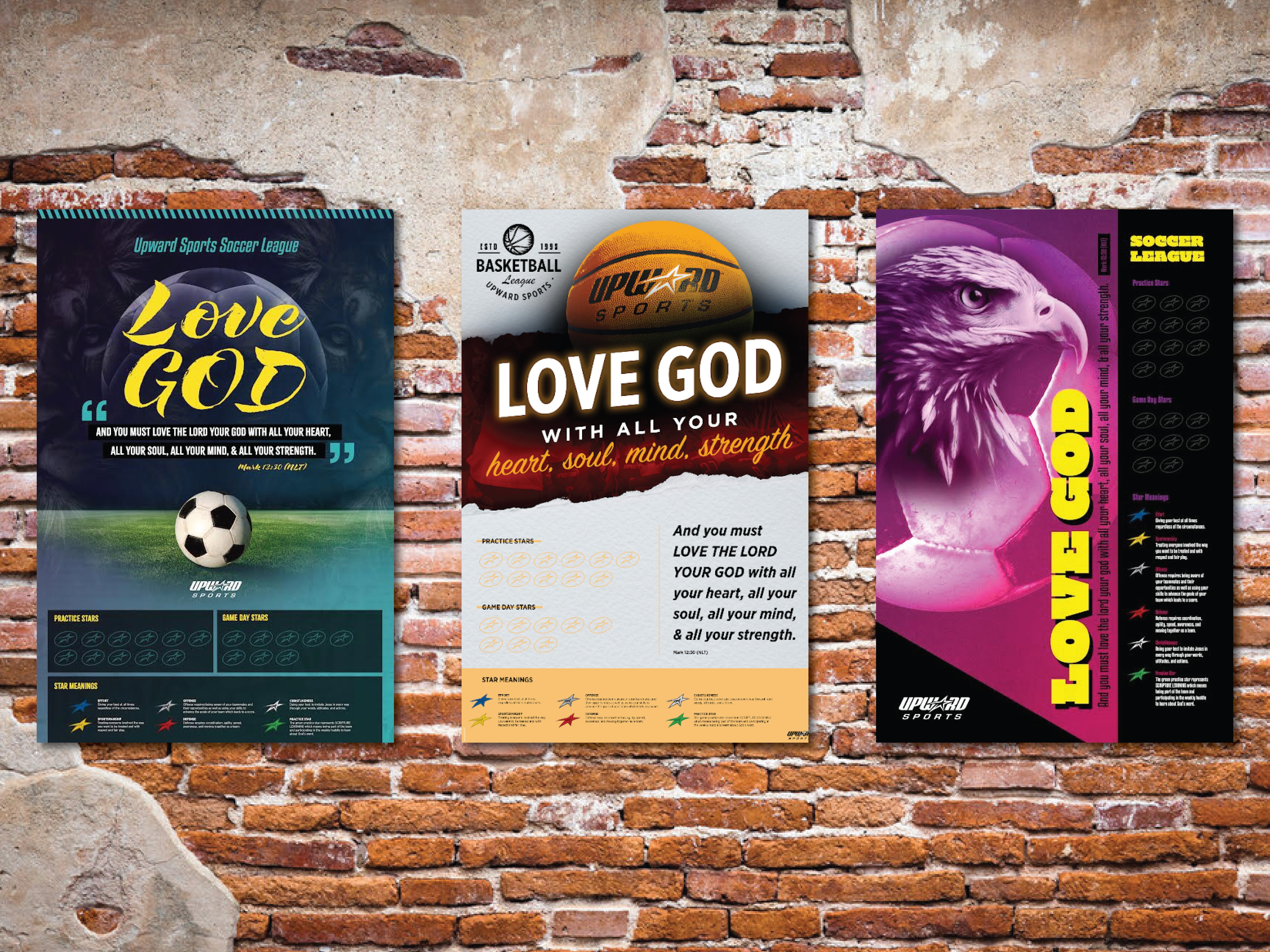
Previously their designs showcased a photo of the various sports with a child athlete playing the corresponding sport. We needed to move away from this direction.
Images of the corresponding sport balls felt over used and didn't resonate with their target audience. It lacked movement and appeal.
It needed to be inspirational, cool, aspirational, dynamic, and appropriate for elementary to high school ages.
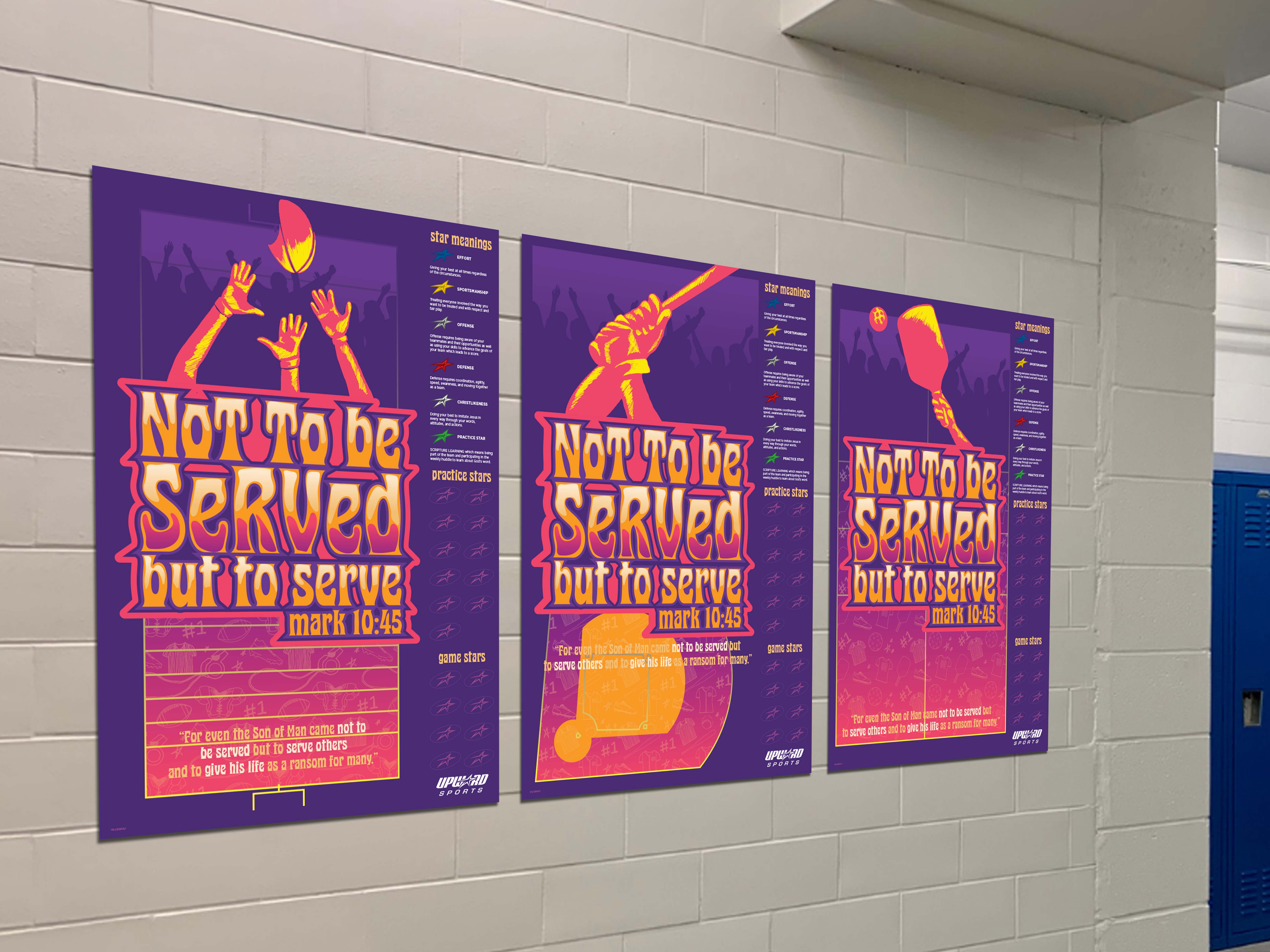
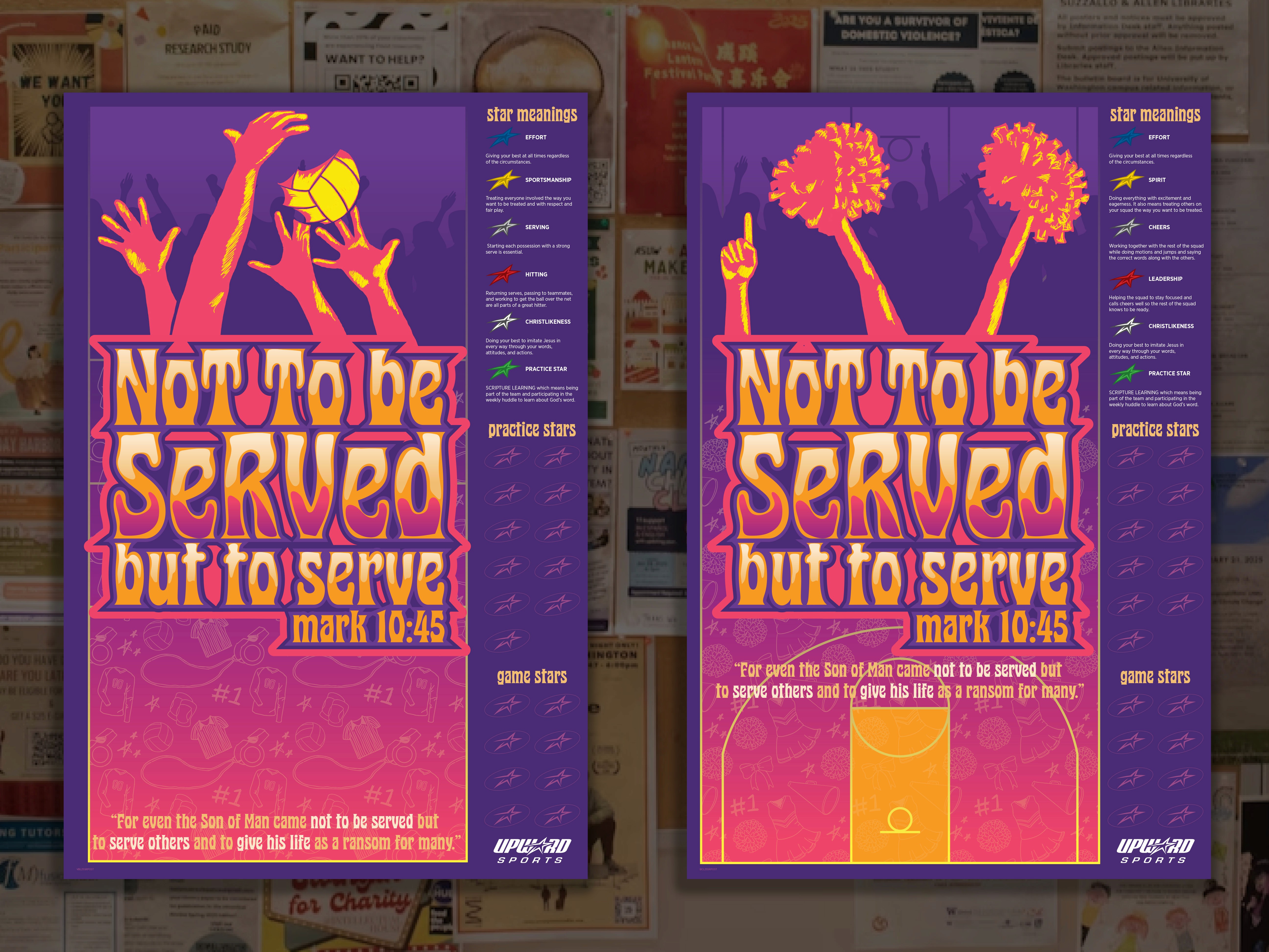
It needed to include: thier logo, sport specific imagery, an area for game day/practice stars tracker, the Bible verse of the season, star meanings and stars with their corresponding color, and their tagline, Play with Purpose (PWP)
Approach
After going over some inspiration photos and directions, we decided to explore 3 different vibes. These are explored in comps (comprehensive layouts). This is a simplified version of the layout to give the idea of what the final will look like. It contains all the necessary elements without getting caught up in the fine details of things.
groovy/70s vibe with strong typography.
coldplay-inspired/neon 80s with a main focus on the word "serve"
a retro skaterink jazz cup vibe
Ultimately we landed on the first comp that features fun groovy typography featuring the theme verse for the year, along with hand-drawn sport specific graphics that highlight each sport without focusing on a specific person, and a fun sport specific pattern at the base of each court/field.
We delivered:
8 sport specific print ready files
asset folder to use as needed
each sport patterns
each main sport graphic
graphic of main verse